
There are doubts about the precision of most statistical data, even when procedures are followed and efficient equipment is used for testing. Excel enables you to calculate the uncertainty based on the standard deviation of your sample.
There are statistical formulas in Excel that we can use to calculate the uncertainty. And in this post we will calculate the arithmetic mean, standard deviation and standard error. We will also see how we can plot this uncertainty in a graph in Excel.
We will use the following sample data with these formulas.
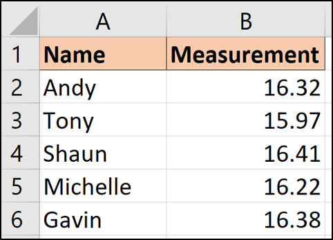
These data show five people who have taken a measurement or reading of some kind. With five different readings, we are uncertain about what the real value is.
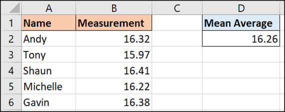
Arithmetic mean of values
When you are uncertain about a range of different values, take the average (arithmetic average) can serve as a reasonable estimate.
This is easy to do in Excel with the AVERAGE function.
We can use the next formula on the sample data above.
=AVERAGE(B2:B6)
Standard deviation of the values
Standard deviation functions show how spread out your data is from a central point (the average average value we calculated in the last section).
Excel has a few different standard deviation functions for various purposes. The two main ones are STDEV.P and STDEV.S.
Each of these will calculate the standard deviation. The difference between the two is that STDEV.P relies on giving you the entire population of values. STDEV.S works with a smaller sample of that data population.
In this example, we are using our five values in the data set, so we will work with STDEV.P.
This function works in the same way as AVERAGE. You can use the following formula in this data sample.
=STDEV.P(B2:B6)
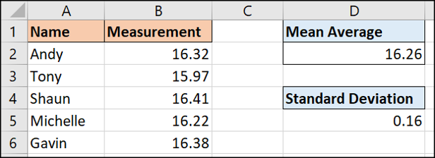
The result of these five different values is 0,16. This number tells us how different each measurement is from the average value..
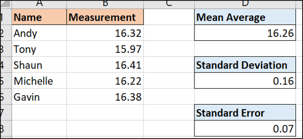
Calculate the standard error
With the calculated standard deviation, now we can find the standard error.
The standard error is the standard deviation divided by the square root of the number of measurements.
The next formula will calculate the standard error in our sample data.
=D5/SQRT(COUNT(B2:B6))
Using error bars to present uncertainty in graphs
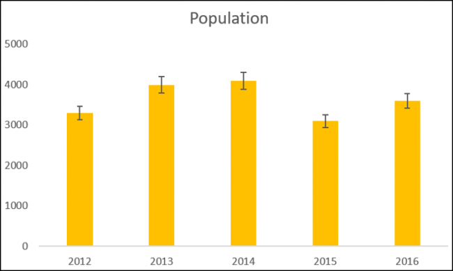
Excel makes it wonderfully simple to plot standard deviations or ranges of uncertainty on charts. We can do this by adding error bars.
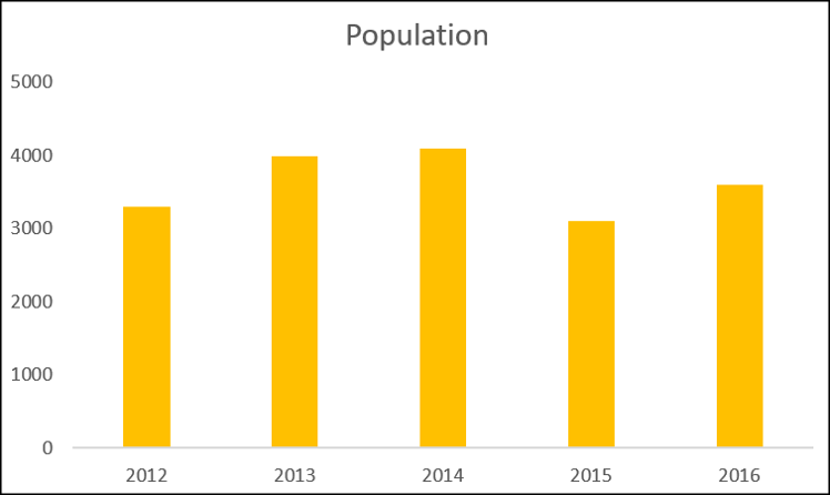
Next, we have a column chart of a sample data set showing a population measured over five years.
With the chart selected, click Design> Add chart element.
Subsequently, choose from the different types of errors available.
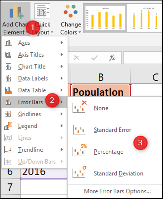
It can display a standard error or amount of standard deviation for all values as we previously calculated in this post. It can also show a percentage error change. The default is 5%.
For this example, we choose to show the percentage.
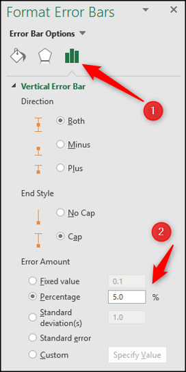
There are a few more options to explore to customize your error bars.
Double-click an error bar in the chart to open the Format Error Bars panel. Select the category “Error bar options” if it is not already selected.
Subsequently, you can adjust the percentage, the standard deviation value or even choose a custom value from a cell that may have been produced by a statistical formula.
Excel is an ideal tool for statistical analysis and reporting. Provides many alternatives to calculate uncertainty so you get what you need.
setTimeout(function(){
!function(f,b,e,v,n,t,s)
{if(f.fbq)return;n=f.fbq=function(){n.callMethod?
n.callMethod.apply(n,arguments):n.queue.push(arguments)};
if(!f._fbq)f._fbq = n;n.push=n;n.loaded=!0;n.version=’2.0′;
n.queue=[];t=b.createElement(e);t.async=!0;
t.src=v;s=b.getElementsByTagName(e)[0];
s.parentNode.insertBefore(t,s) } (window, document,’script’,
‘https://connect.facebook.net/en_US/fbevents.js’);
fbq(‘init’, ‘335401813750447’);
fbq(‘track’, ‘PageView’);
},3000);